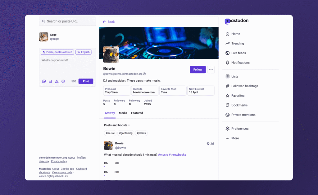
Mastodon Redesigns Profiles to Simplify User Experience
Mastodon is overhauling its user interface, introducing a significant redesign of profile pages aimed at reducing complexity for newcomers. The update seeks to make the decentralized platform more accessible to a mainstream audience, bridging the gap between its technical architecture and the intuitive experience found on services like X and Threads.
The revamped profile layout arrives as the platform attempts to regain momentum. Currently, Mastodon reports approximately 800,000 monthly active users, a decline from the peak figures reached during the initial transition of Twitter users following Elon Musk’s acquisition of the site.
Key Visual and Functional Updates
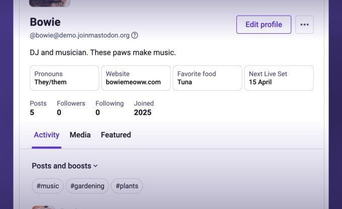
The most immediate change involves the consolidation of post views. Previously, users navigated between separate tabs for “posts” and “posts and replies.” This has been replaced by a single “Activity” tab, which utilizes a dropdown menu for users to toggle specific content types, including replies and “boosts.” Furthermore, hashtags now appear at the top of this tab, offering a native filtering mechanism for account activity.
The update also addresses specific layout frustrations:
- Pinned Posts: The previous carousel interface has been removed in favor of a single featured post, with a “View all pinned posts” button for additional content.
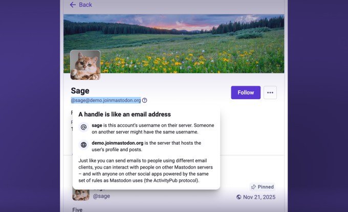
- Handle Clarity: To help users understand the decentralized address format (which includes both a username and server name), a new informational pop-up has been added.
- Customization: Users gain more control over profile visibility, including the ability to hide “Media” or “Featured” tabs and manage replies directly within the “Media” section.
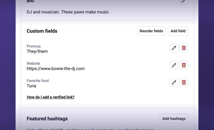
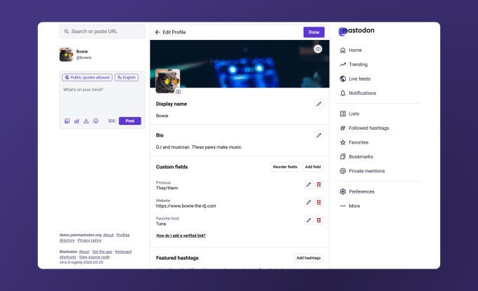
- Field Editing: Custom profile fields can now be edited on mobile devices (iOS and Android) as well as the web, and are displayed in a side-by-side format to save vertical space.
Management of profile data has also been unified. Settings related to featured hashtags, links, and biographical information are now located in a single, cohesive area of the account settings. Additionally, Mastodon has moved the “personal note” feature to an overflow menu and removed the “following you” badge to reduce visual clutter.
Beyond layout adjustments, the platform has made link verification more prominent, moving it out of the deep settings menu. Users also gain the ability to crop and add alt text to profile and cover images directly within the interface.
The redesign is currently rolling out to the mastodon.social server and instances running the nightly build. A broader deployment is scheduled for the upcoming Mastodon 4.6 software release, expected in the coming weeks.